The Kitchen
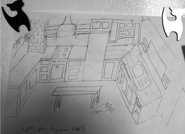
I had to update this post, I found our original sketch!
The kitchen is the center of the home. It’s where meals and memories will be made for years to come, and it’s where I’ll spend most of my time. Because it’s that important to me, I’ve had a hard time making decisions, so we recruited architect Nick Rada to help in the process. I was introduced to Nick through the wyckoffheights.org blogger. It was a stroke of random luck. Nick is the best of the best (seriously). I’m so pleased with his design and tireless work on this project.
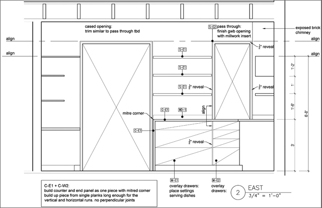
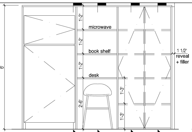
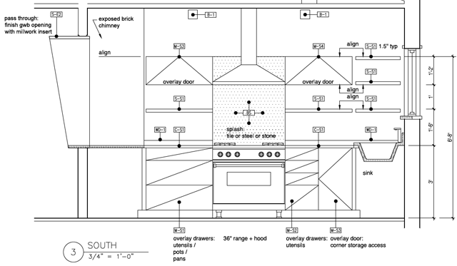
Top priority for me was a functional cooking space. Nick’s plans addressed that and more – pots and pans are located by the stove; the dishwasher is by the sink; the garbage draw is located by the back door; there’s proper storage; I’ll have many outlets located in all the right places; and there’s ample counter space.
The plans:
The full plans are here, revised north view here.
I told Nick to run with it from the beginning. The kitchen will be modern. I never thought I’d want a modern kitchen but when I started to research cabinet faces, I realized I didn’t like the ornate stuff. I liked simplistic. Also, I’m only doing this once, I didn’t want to choose a style that inevitably would look dated. With the incorporation of wooden counter tops (American chestnut) and wooden ceiling beams – I was sold.
When I started to shop around for cabinetry, the quotes were high, service sub-par and most of the cabinets were made of a combination of wood and that cheap composite fake stuff, ugh! It didn’t seem worth it and I wanted something really special for my kitchen so we hired a fantastic cabinetmaker, George Spaeth. He’s building out the whole kitchen.
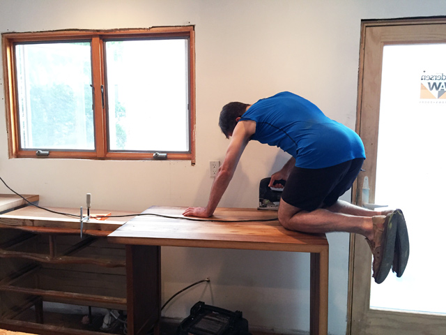
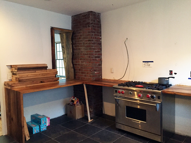
George installing the countertops
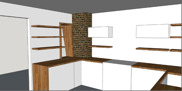
Here’s a feel of what the kitchen will look like!
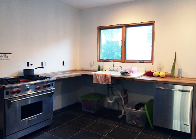
Above is where we’re at.
We reduced the amount of upper cabinets throughout the design phase. They were replaced by American chestnut shelving. The shelves match the counter tops – which you can see above, stacked on the counter. Less uppers will make the space feel open and light. I’m hoping this will force me to be neat and organized because my dishes and glasses will be exposed for all to see. It’s time to get rid of those non-matching coffee mugs!
The cabinets will be white washed, flat, no pattern or knobs. Subway tile will line the wall 2 feet up from the counter.
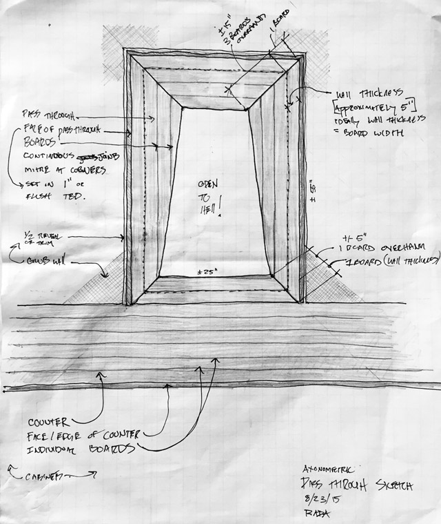
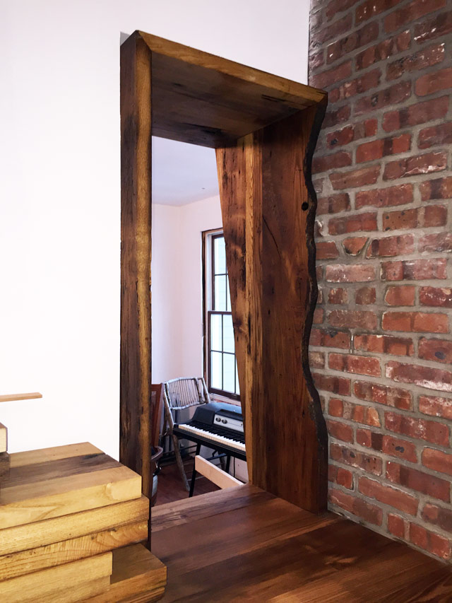
The sketch below is of what we like to call “the confessional”. Nick and George collaborated on this detail based on my input regarding open layout vs. closed. I wanted a level of privacy for the kitchen. I love open layout in theory but when you have four burners going, the oven on and a sink full of dishes, you need a buffer. They designed a small opening – it will serve as a pass-through for food and drinks! This, along with a wide entryway makes the kitchen feel open while keeping a level of privacy. The first sketch of “the confessional”…
Here’s a rendering George made based on Nick’s drawing.
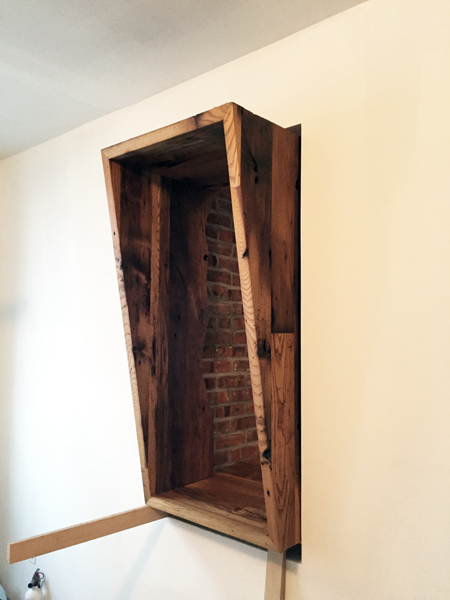
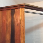
The final form:
Looking into the dining room:
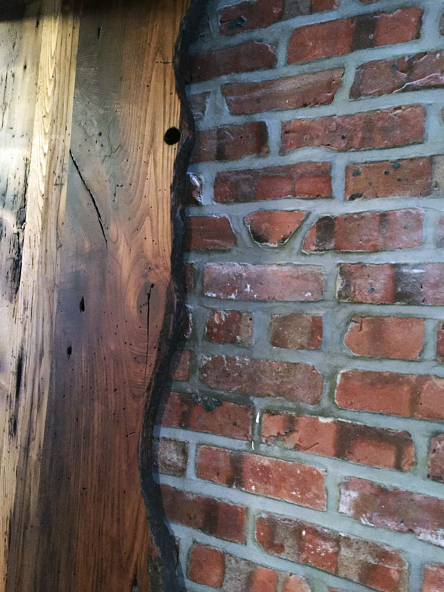
This beautiful curved piece of wood is from a drinking trough. The wood is worn from decades of animals using it – leaning over the trough for water. Detail…
All the wood for the kitchen is from a barn in Massachusetts.
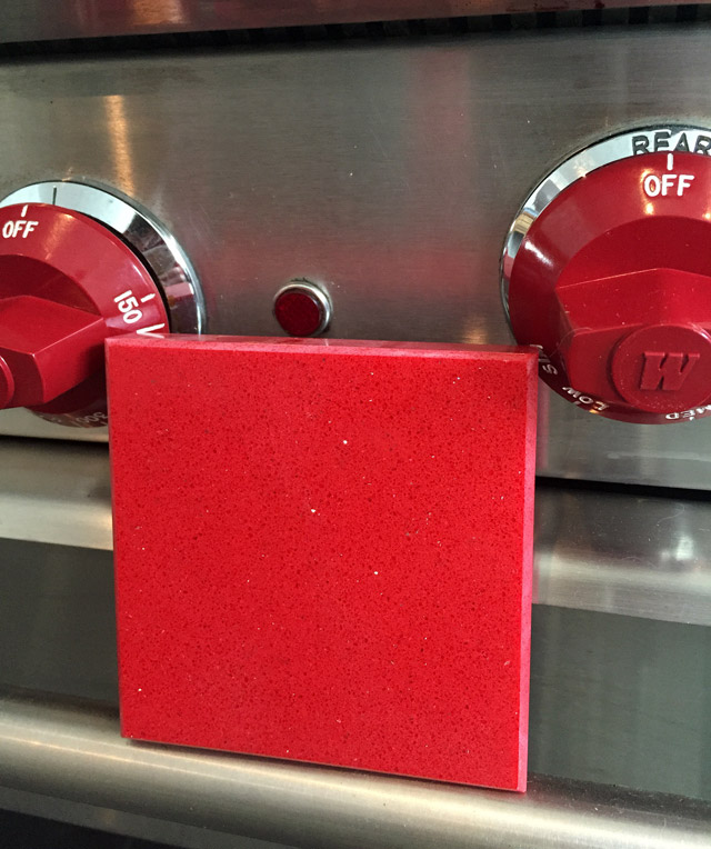
Other notes… all appliances are stainless steel and as I’ve mentioned, we found the WOLF. Red will be the accent color in the kitchen. Nick thought it would be cool to add a red slab of color between the riser and the oven hood. I’m leaning towards this caesar slab.
We found a vintage cast iron sink in Rockaway!
The floor: I didn’t go with a black and white checkered floor which is (as most of you know) a signature Glorified Tomato look. I struggled with this but in the end I felt it would detract from the Chestnut counter tops and “the confessional” which are the main features of the kitchen design. I went with charcoal gray imported Italian tile. You can see the flooring here…
George is working on the cabinets and I’m hoping they’ll be ready to install in the next few weeks. I’ll update when they go in!
